The Pantone Color of the Year: Its Importance, Impact, and Applications in Marketing and Design
Share
Color is more than an aesthetic choice—it’s a communication tool that conveys emotions, influences behavior, and shapes perceptions. Every year, the Pantone Color Institute announces the Pantone Color of the Year, a choice that reflects global cultural trends, emotions, and societal shifts. This annual selection holds significant weight for industries like fashion, design, and marketing, as it shapes creative direction and consumer preferences.
In this blog, we’ll explore the Pantone Color of the Year, why it matters, its potential impacts, and how organizations can leverage the power of color in marketing and graphic design.
What is the Pantone Color of the Year?
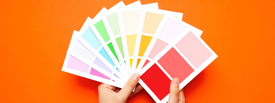
The Pantone Color of the Year is an annual color selection by the Pantone Color Institute, a global authority on color standardization and trends. Since its inception in 2000, the initiative has gained traction as a cultural and creative phenomenon.
The chosen color is not arbitrary—it results from extensive research and analysis of global trends. Pantone’s team examines industries such as fashion, interior design, technology, and entertainment, as well as broader influences like art, politics, and social movements.
Pantone’s 2024 Color of the Year: 13-1023 Peach Fuzz
The 2024 Color of the Year, 13-1023 Peach Fuzz, embodies boldness, vitality, and energy. This hue represents a heartfelt peach hue bringing a feeling of kindness and tenderness, communicating a message of caring and sharing, community and collaboration, according to Pantone.
Why the Pantone Color of the Year Matters
The Pantone Color of the Year is more than just a pretty hue; it’s a barometer of the times, encapsulating the mood of the global community. Here’s why it holds importance:
1. It Sets Trends Across Industries
The Color of the Year influences trends in fashion, interior design, product development, and more. Brands often align their seasonal collections and launches to reflect the chosen color.
2. It Inspires Creative Direction
Graphic designers, marketers, and artists draw inspiration from the Color of the Year to craft campaigns, logos, and visual narratives that resonate with contemporary aesthetics.
3. It Reflects Societal Sentiments
Each selection captures the essence of global emotions and priorities. For instance:
- Classic Blue (2020): Evoked calm and reliability during uncertain times.
- Very Peri (2022): Symbolized transformation and creativity post-pandemic.
4. It Drives Consumer Behavior
Consumers are naturally drawn to what feels fresh and relevant. Incorporating the Color of the Year into products and branding can create a sense of modernity and trend alignment, boosting engagement and sales.
The Psychological Power of Color in Marketing
Colors aren’t just visual—they’re deeply psychological. Different hues evoke different emotions and associations, making color a powerful tool in marketing and graphic design.
How Colors Influence Emotions and Decisions
- Red: Passion, urgency, and energy. Often used in clearance sales and fast food.
- Blue: Trust, calm, and reliability. Popular in finance and healthcare industries.
- Yellow: Optimism and warmth. Common in brands targeting youthful audiences.
- Green: Growth, health, and sustainability. Widely used in eco-friendly initiatives.
Case Study: Coca-Cola’s Red
Coca-Cola’s signature red color is synonymous with excitement and joy. The company has leveraged this hue consistently to create brand recognition and evoke positive emotions worldwide.
Leveraging the Pantone Color of the Year in Marketing and Design
Organizations can use the Pantone Color of the Year strategically to enhance branding, campaigns, and product design.
1. Branding Updates
Refreshing your logo, packaging, or digital assets with the Color of the Year signals modernity and alignment with current trends.
2. Seasonal Campaigns
Seasonal promotions are an excellent opportunity to integrate the chosen hue into advertisements, social media posts, and storefront displays.
3. Product Design
Launching limited-edition products in the Pantone Color of the Year can drive buzz and exclusivity.
4. Event Themes
Incorporate the Color of the Year into event décor, promotional materials, and giveaways to create a cohesive and contemporary theme.
Tips for Using Colors Effectively in Graphic Design
When incorporating the Pantone Color of the Year into your designs, consider these best practices:
1. Maintain Brand Consistency
While the Color of the Year is trendy, ensure it complements your existing brand palette and values.
2. Understand Color Pairings
Use tools like the Pantone Color Finder to explore harmonious combinations. For example, a bold red can be paired with neutrals like white or gray for balance.
3. Emphasize Accessibility
Ensure your color choices are legible and inclusive by adhering to accessibility standards like contrast ratios.
4. Leverage Color Psychology
Align your color usage with the emotions and actions you want to evoke in your audience.
5. Experiment with Contexts
Test the Color of the Year across various formats—digital ads, print materials, and packaging—to find its most impactful applications.
Potential Impacts of the Pantone Color of the Year
The Pantone Color of the Year’s influence spans multiple domains:
1. Consumer Trends
Expect a surge in popularity for products and designs that feature the chosen hue. Early adopters gain a competitive edge in capturing audience interest.
2. Marketing Strategies
Marketers often incorporate the color into campaigns to stay relevant and align with audience expectations.
3. Design Innovation
The Color of the Year inspires experimentation with new patterns, textures, and styles, fostering innovation in graphic and product design.
Examples of Organizations Using Colors Effectively
1. Airbnb’s Gradient Branding
Airbnb’s use of soft, gradient tones conveys warmth and community, aligning with its brand message of belonging.
2. Apple’s Colorful Product Launches
Apple’s colorful product lines, like the iMac and iPhone, consistently capture consumer attention by blending innovation with bold, appealing hues.
3. Nike’s Bold Campaigns
Nike leverages dynamic and high-contrast colors to create a sense of energy and empowerment in its ads and product designs.
Conclusion
The Pantone Color of the Year is a testament to the importance of color as a tool for communication and connection. For businesses and creatives, it offers an opportunity to align with cultural trends, refresh designs, and engage audiences in meaningful ways.
By understanding the psychological impact of color and strategically integrating it into marketing and graphic design, organizations can harness its full potential to drive innovation and results.
Whether you’re a seasoned designer or a business owner exploring new avenues, the Pantone Color of the Year is a reminder that creativity is always in season. Let this year’s color inspire bold decisions and vibrant strategies!